2019
Project supervised by : Song Kee Hong
In collaboration with : Government Technology Agency (GovTech)
Designed with : Tan Kahwee & Ong Kahmin
Kampung Heroes
Project Brief : How might we design a wearable that will help seniors who are living alone to call for help when needed?
This project revolved around designing a product that addresses the client's needs on the low adoption rate of a health emergency button that caters to the Merdeka generation.
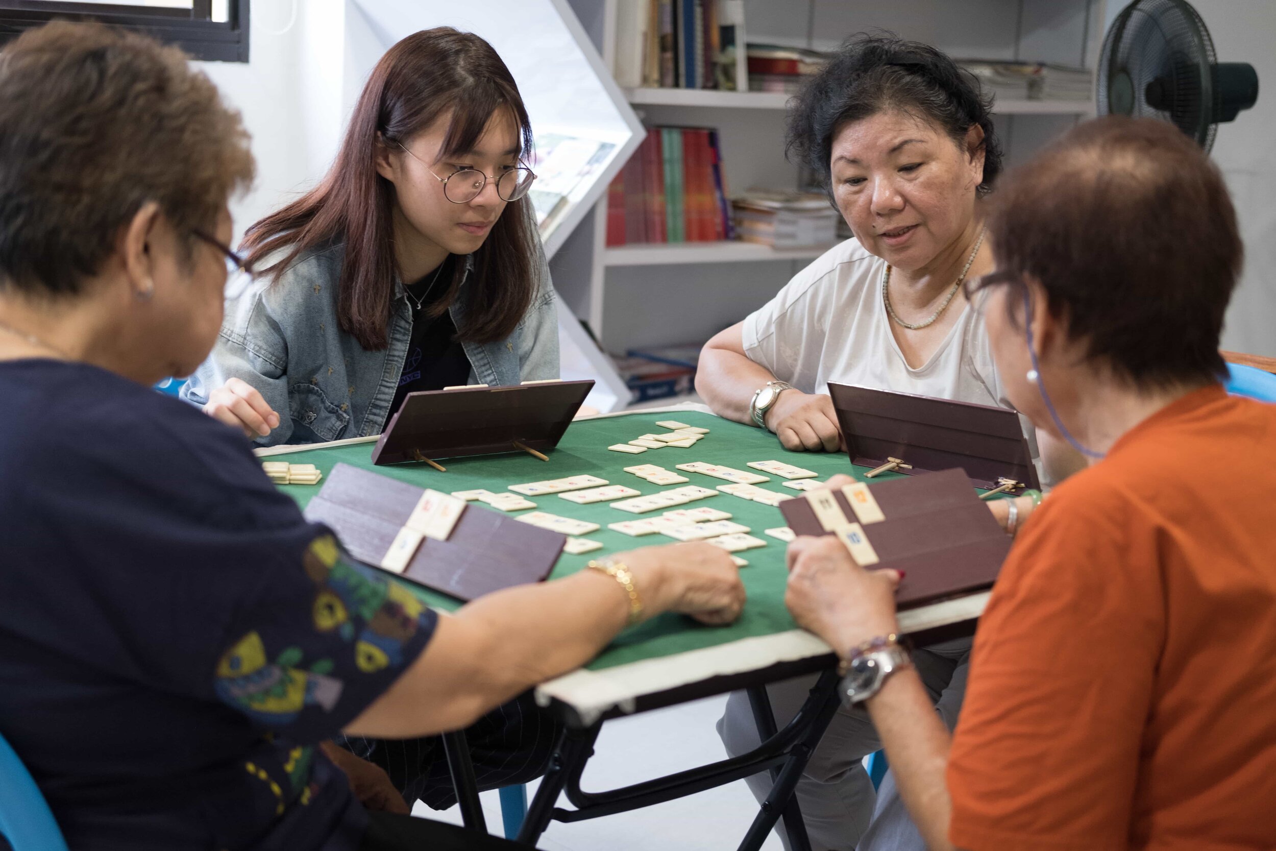
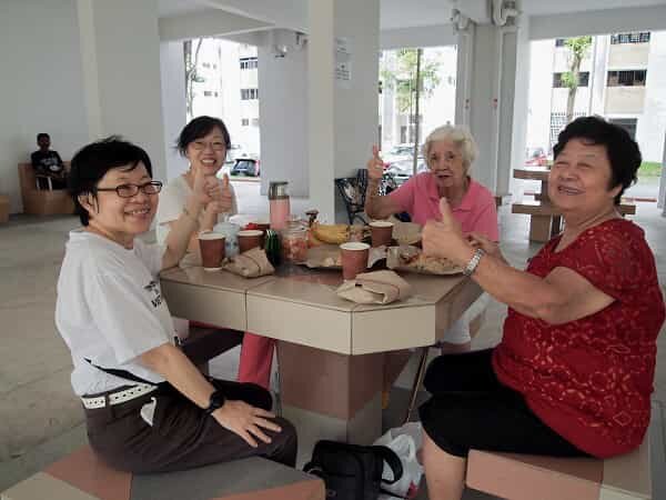
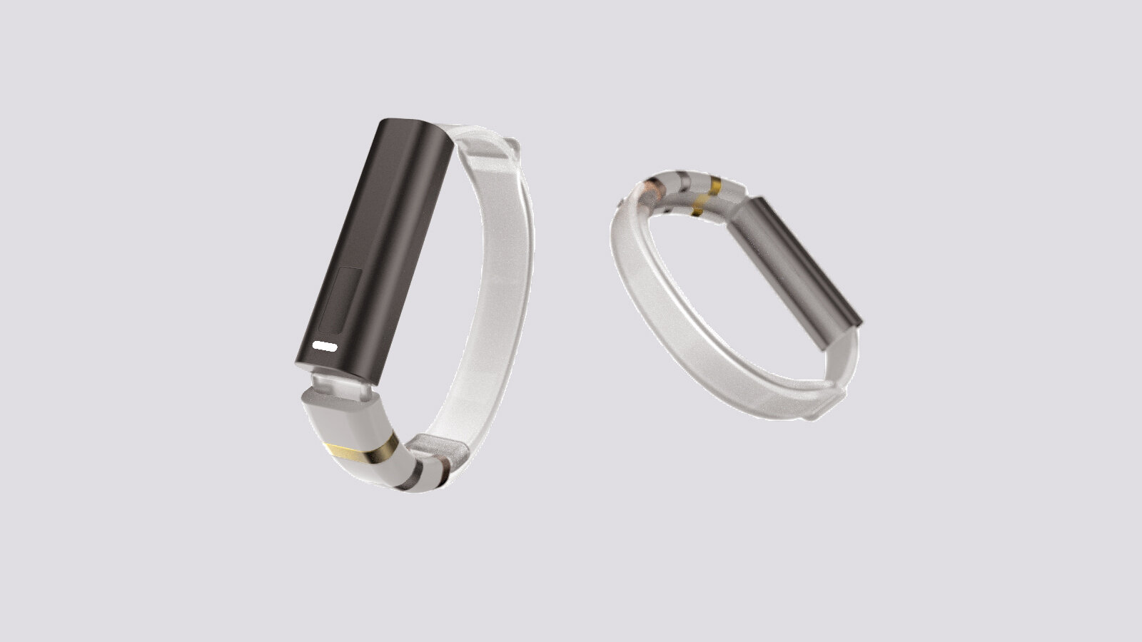
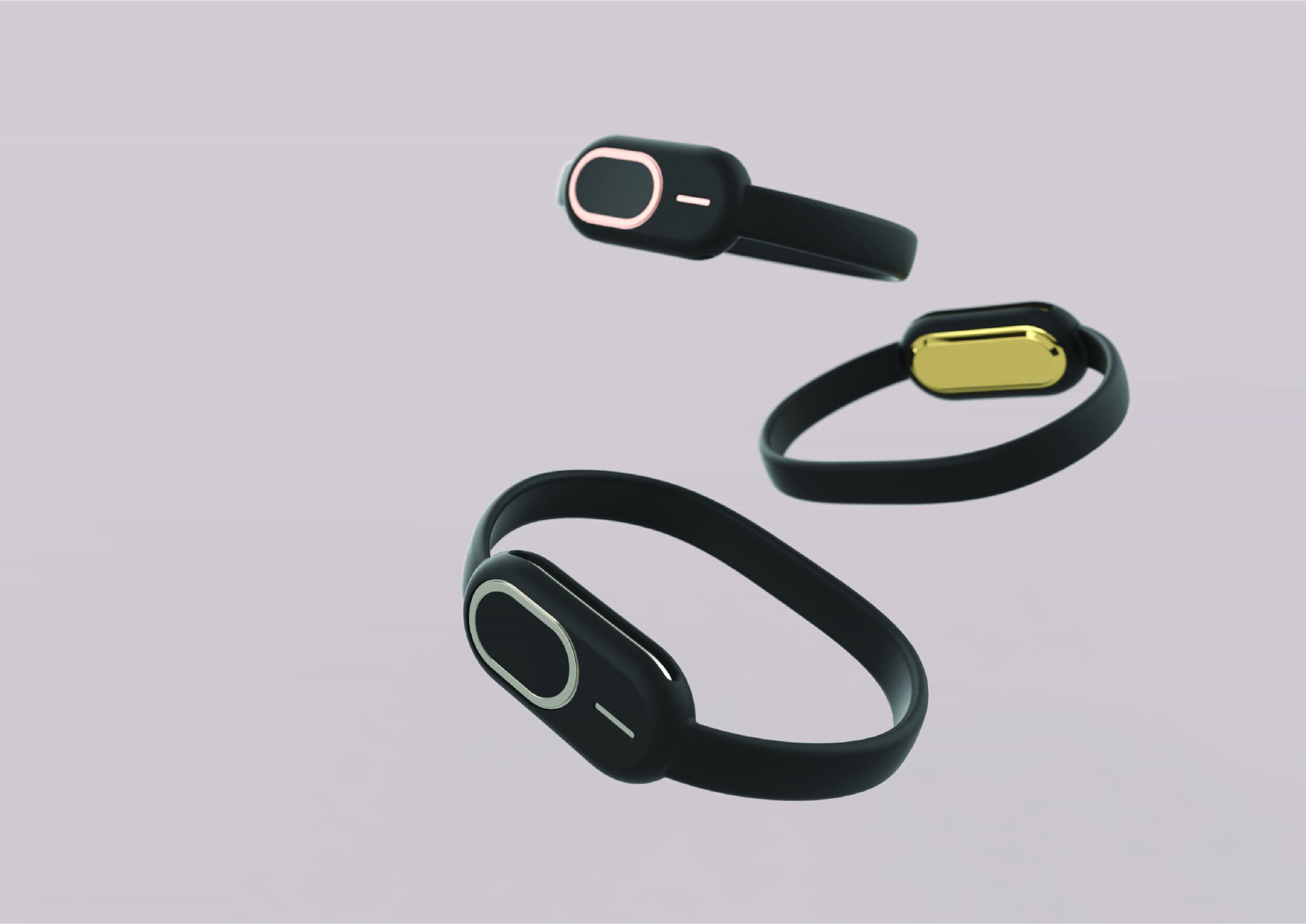
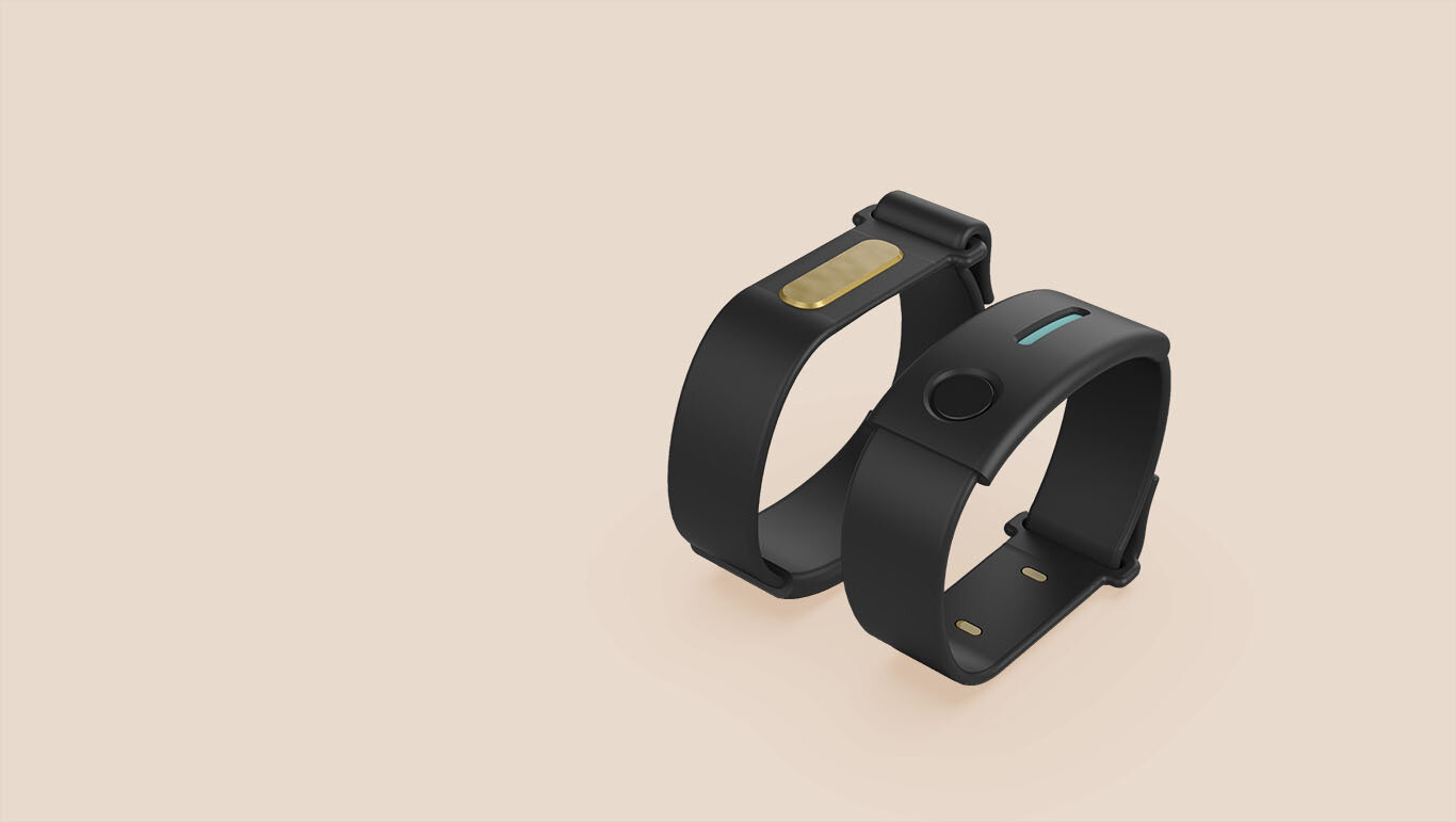
Kampung Heroes was then designed to foster a well-knitted community just like the local Kampung times.
We leveraged on human connection and social recognition, both insights gained through user research to design a band that empowers users to aid one another in midst of any health emergencies accompanied with an intuitive front and back-end system.
User Research
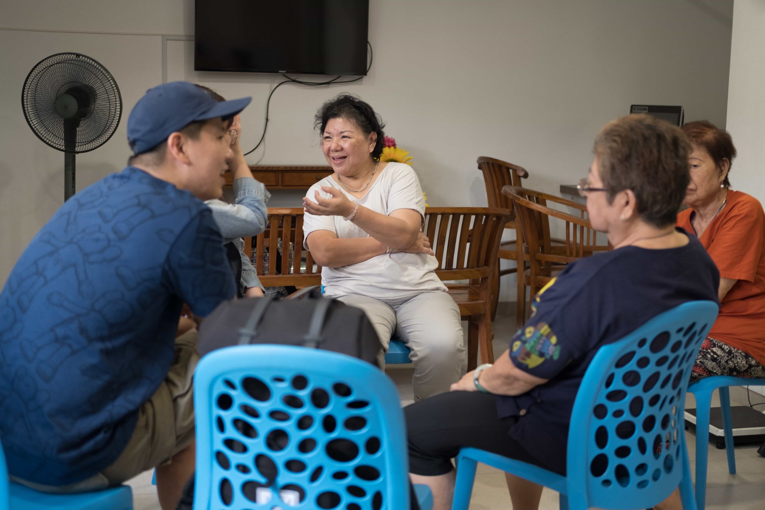
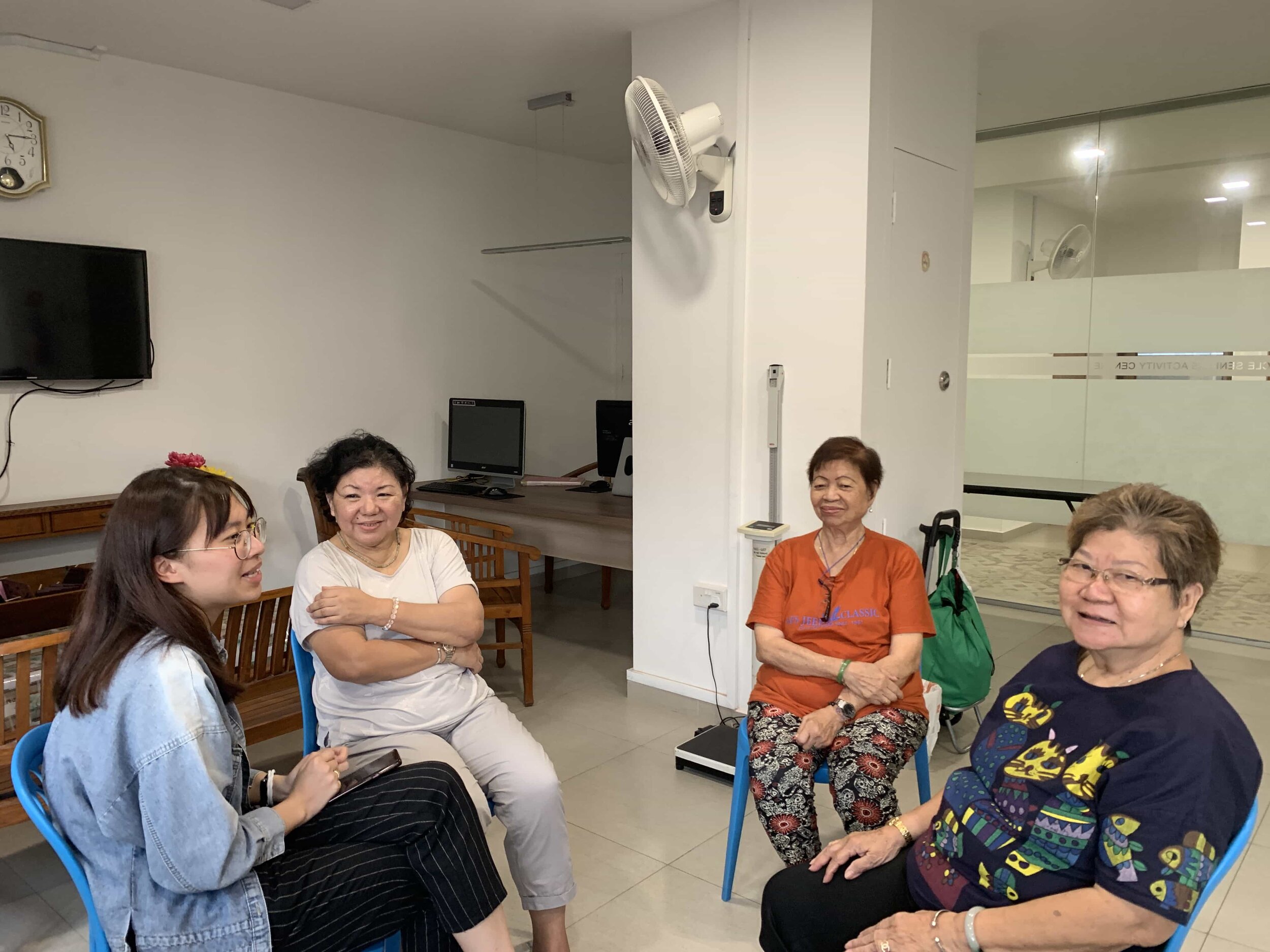
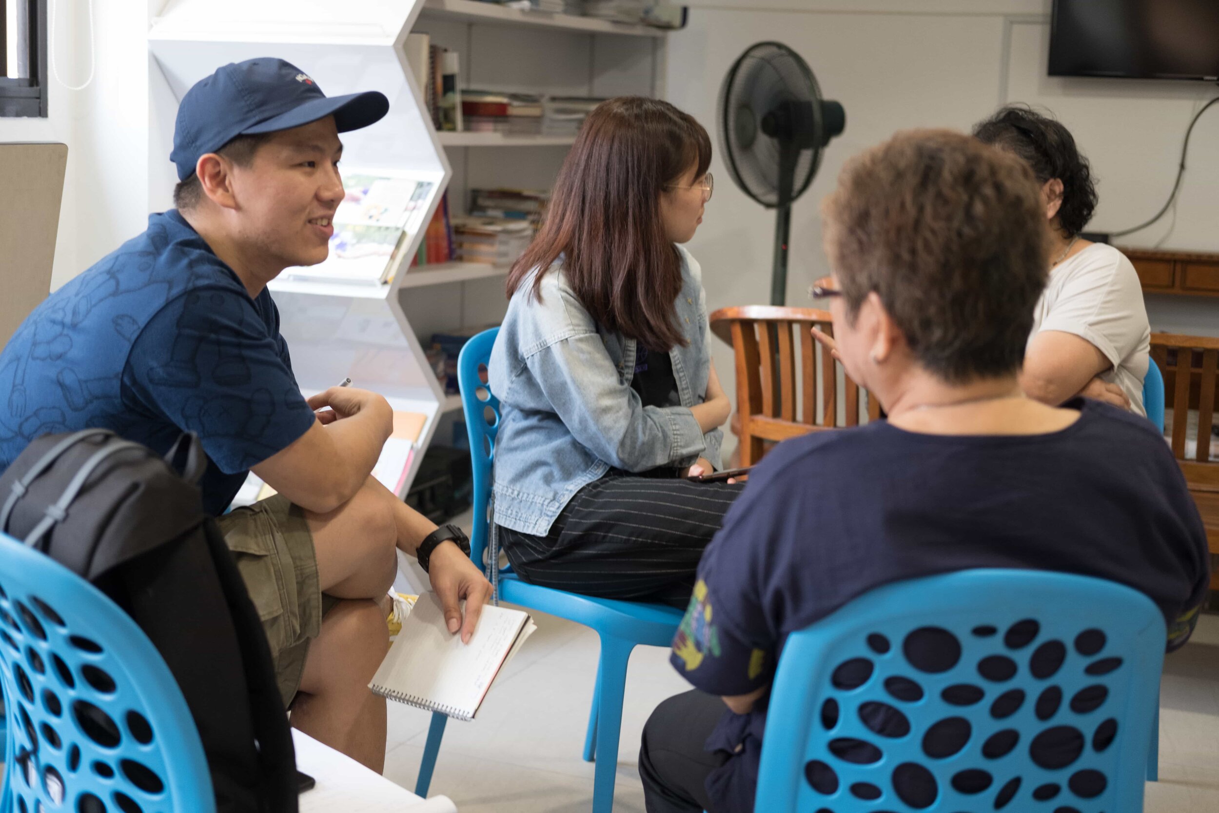
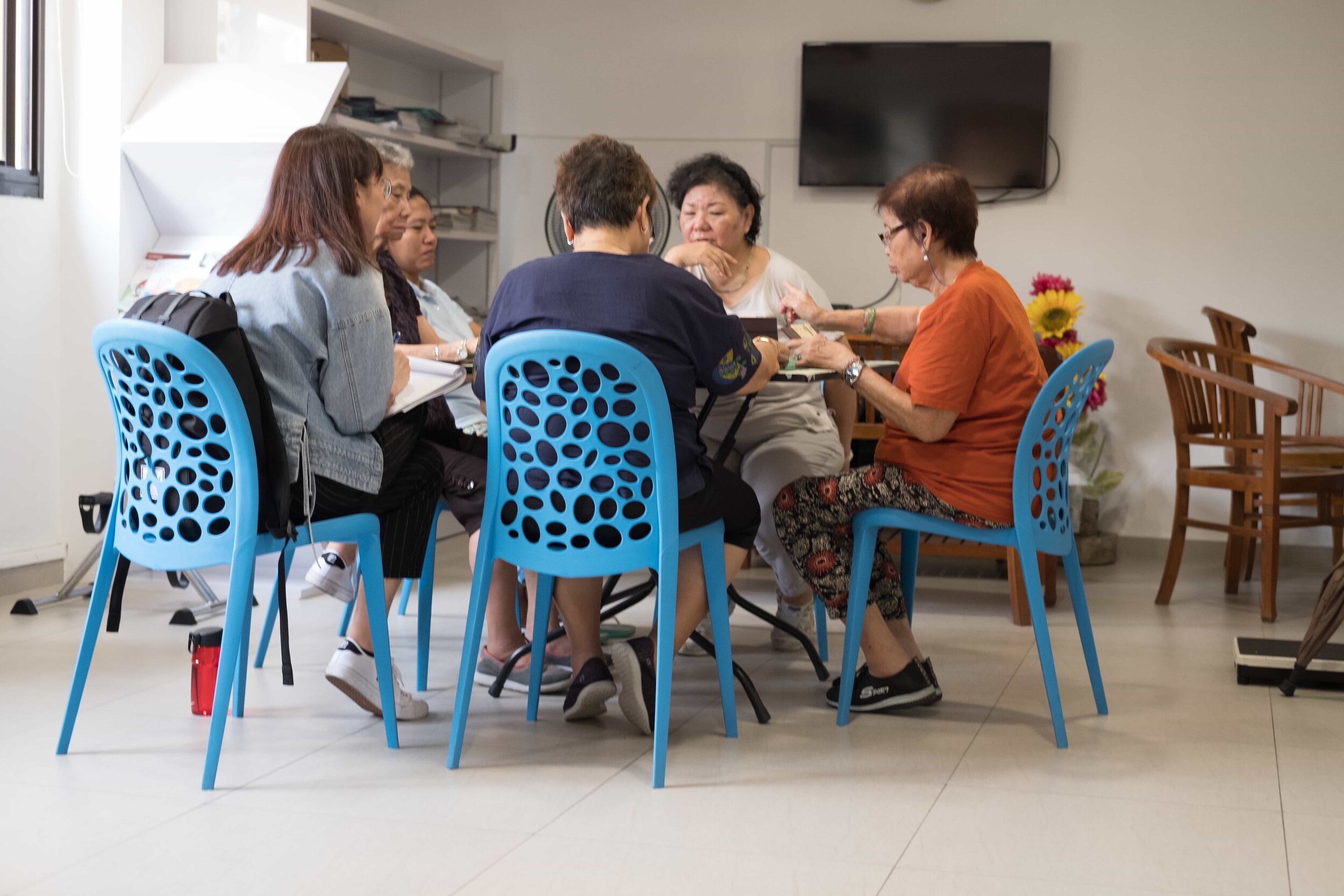
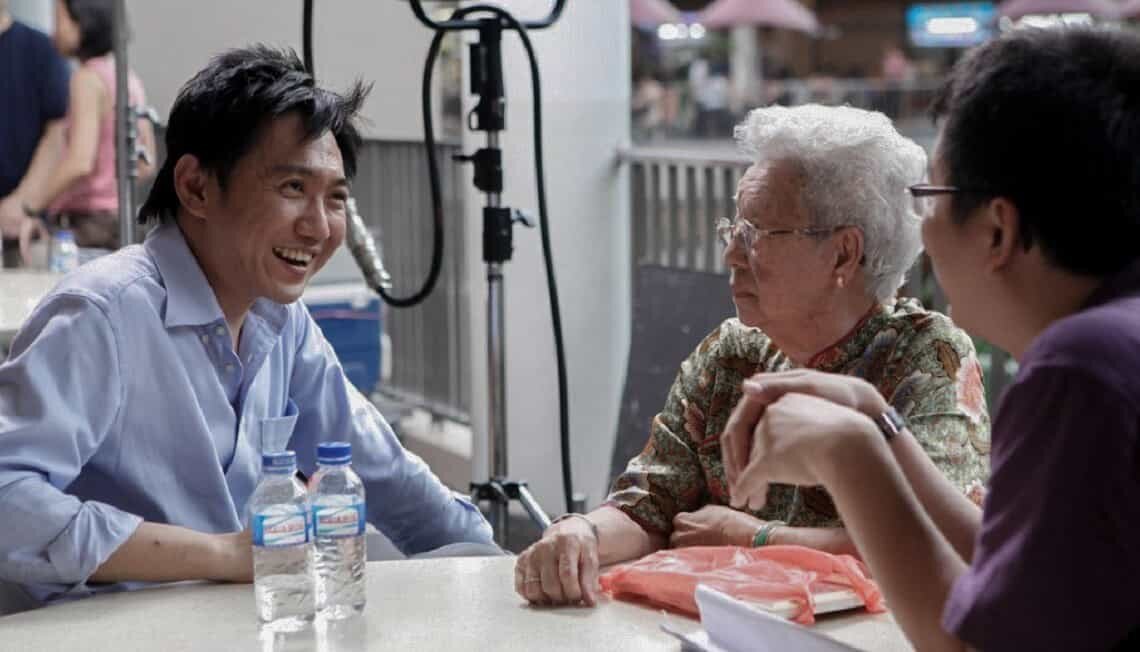
Through our user research, we managed to gain a few insights pertaining low adoption rate and gaps between existing front and back-end system adopted by GovTech.
With the image below showing the existing protocols of the system, we understood that the National Responders & SAC [people who are the 1st respondents to elderly pressing the emergency button] firstly have to triage situations during emergencies. Secondly, due to the low adoption rate of the emergency button, they have to go beyond and take care of elderlies’ basic welfare and emotional needs to better ensure the safety of the elderlies.
National Responders & SAC
A few prominent gaps between the existing front and back-end system adopted by our client
Due to privacy purposes, photographs weren't allowed to be taken for the back-end system, but we recreated a rough wire of how it looked like
The existing back-end system was relatively challenging to navigate due to its unintuitive interface and the lack of technical support/update of the system.
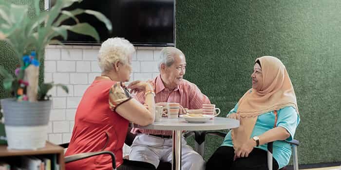
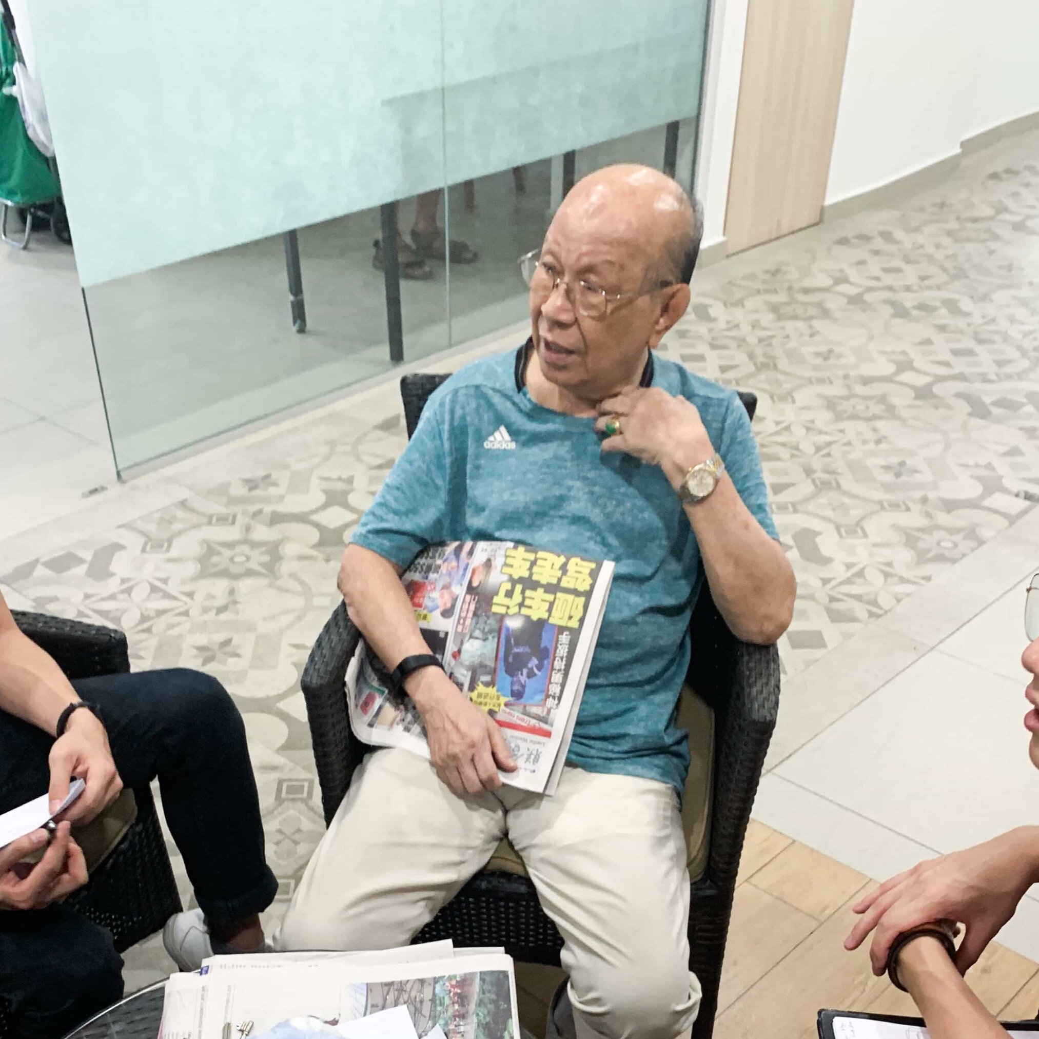
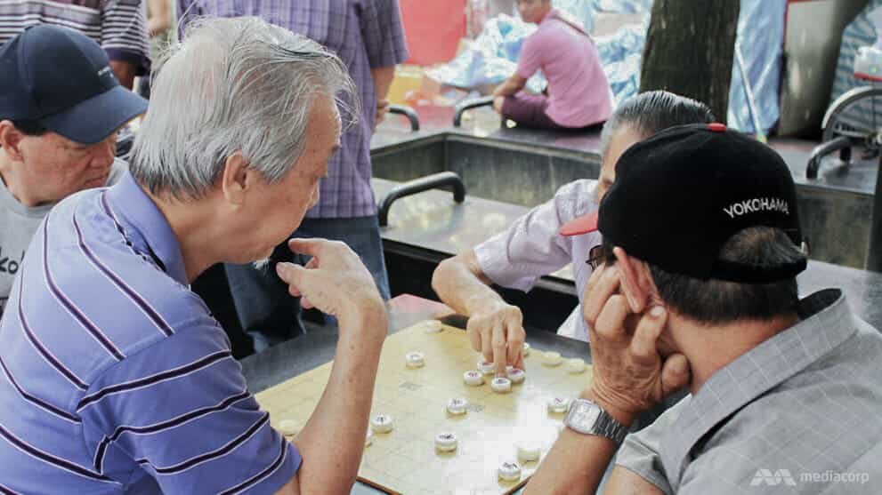
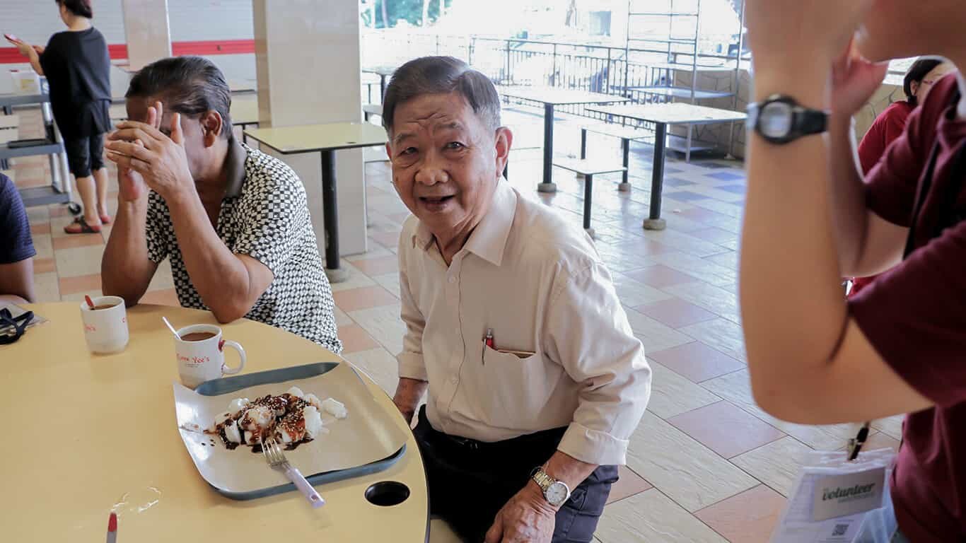
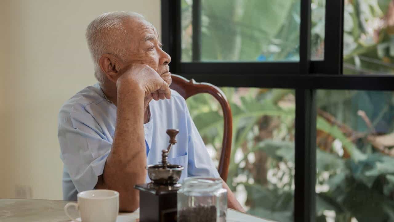
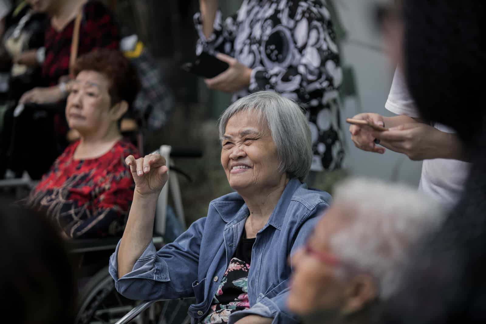
Elderly
01 | Desire human connection
“以前的 Kampung 全部的门都是开的,现在政府组屋,门都是关的“
“During Kampung times in the past, all the doors are left opened, now in HDB, all the doors are closed.”
02 | Desire social recognition
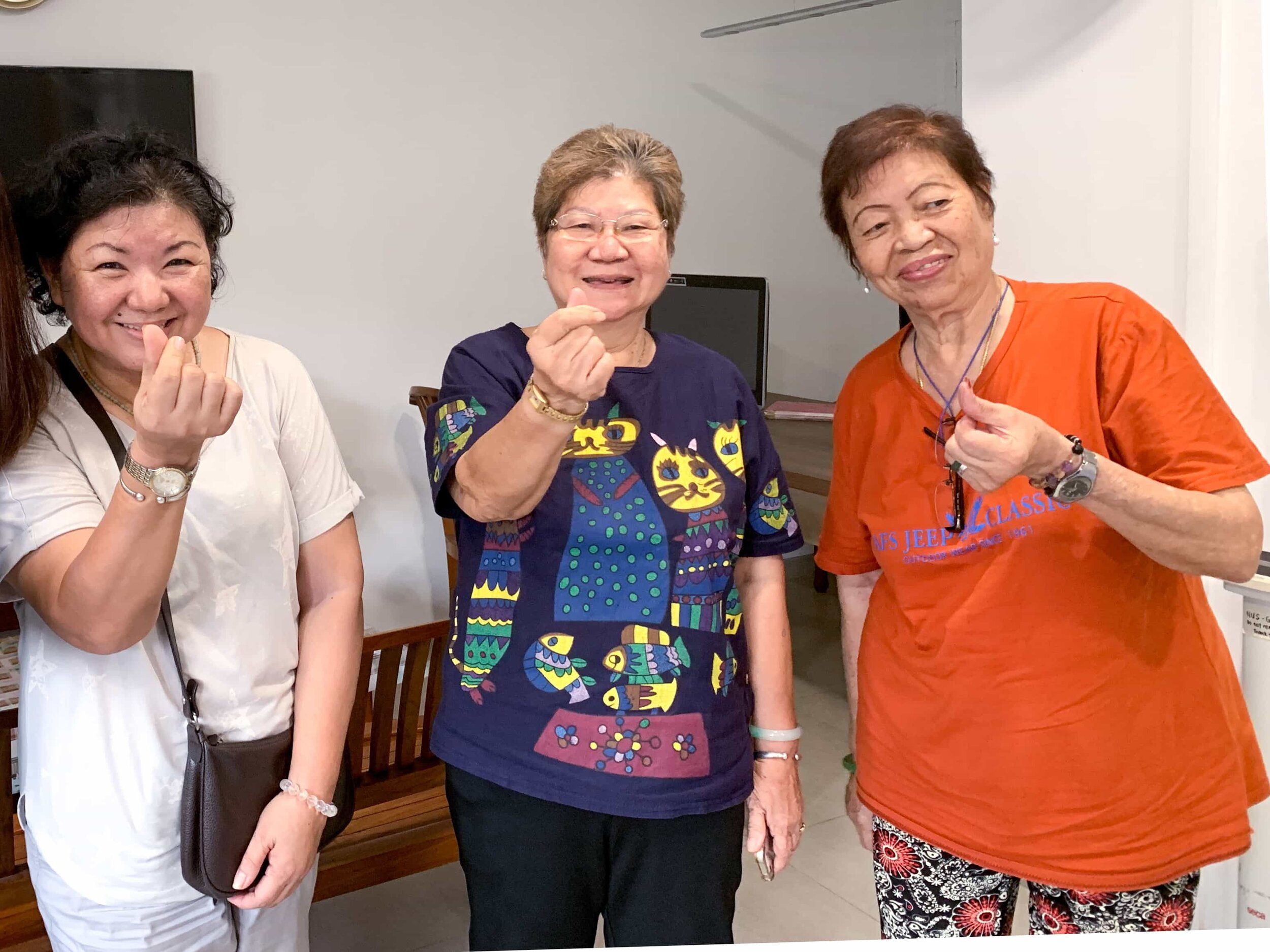
“你看我们去哪个 course,有四方帽,我的孙说阿嬷都毕业leh”
“You see, we went to a course, wore convocation caps, my grandchildren said that even their grandmother is also a graduate leh”
“这是我这辈子最成功的照片“
“In my whole life, this is my most sucessful photo”
Opportunity Statement
How might we be able to drive adoption through helping the Merdeka Generation Break-the-Ice, Reconnect and Help one another again?
Therefore Kampung Heroes aims to foster a well-knitted community just like the local Kampung times.
Leveraging on human connection and social recognition, the wearable empowers the community to reconnect and help one another fulfil basic welfare and emotional needs.
This allows the National Responders and SAC to better triage situation in midst of any health emergencies with an intuitive front and back-end system.
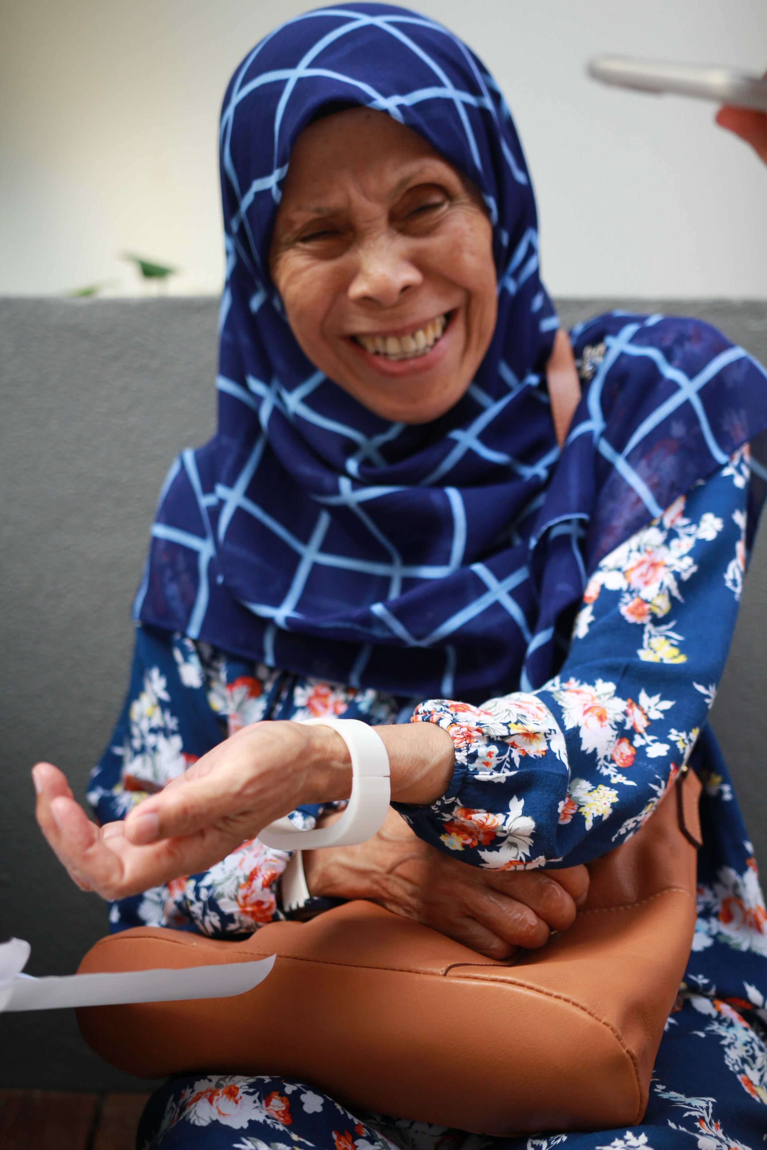
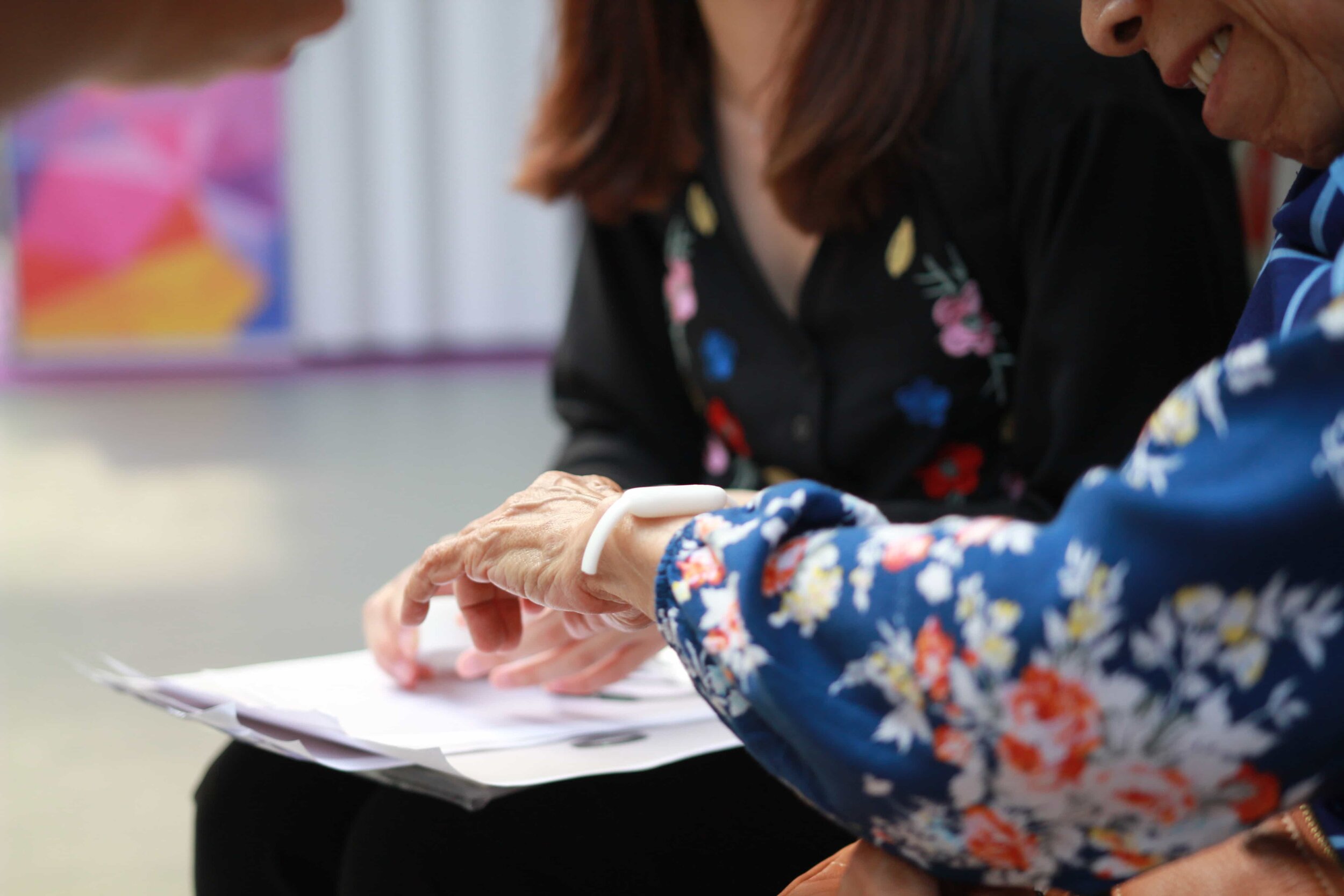
Through observations, we saw that wrist is the unobtrusive and highest acceptance position for the wearable design.
Ideations & Iterations
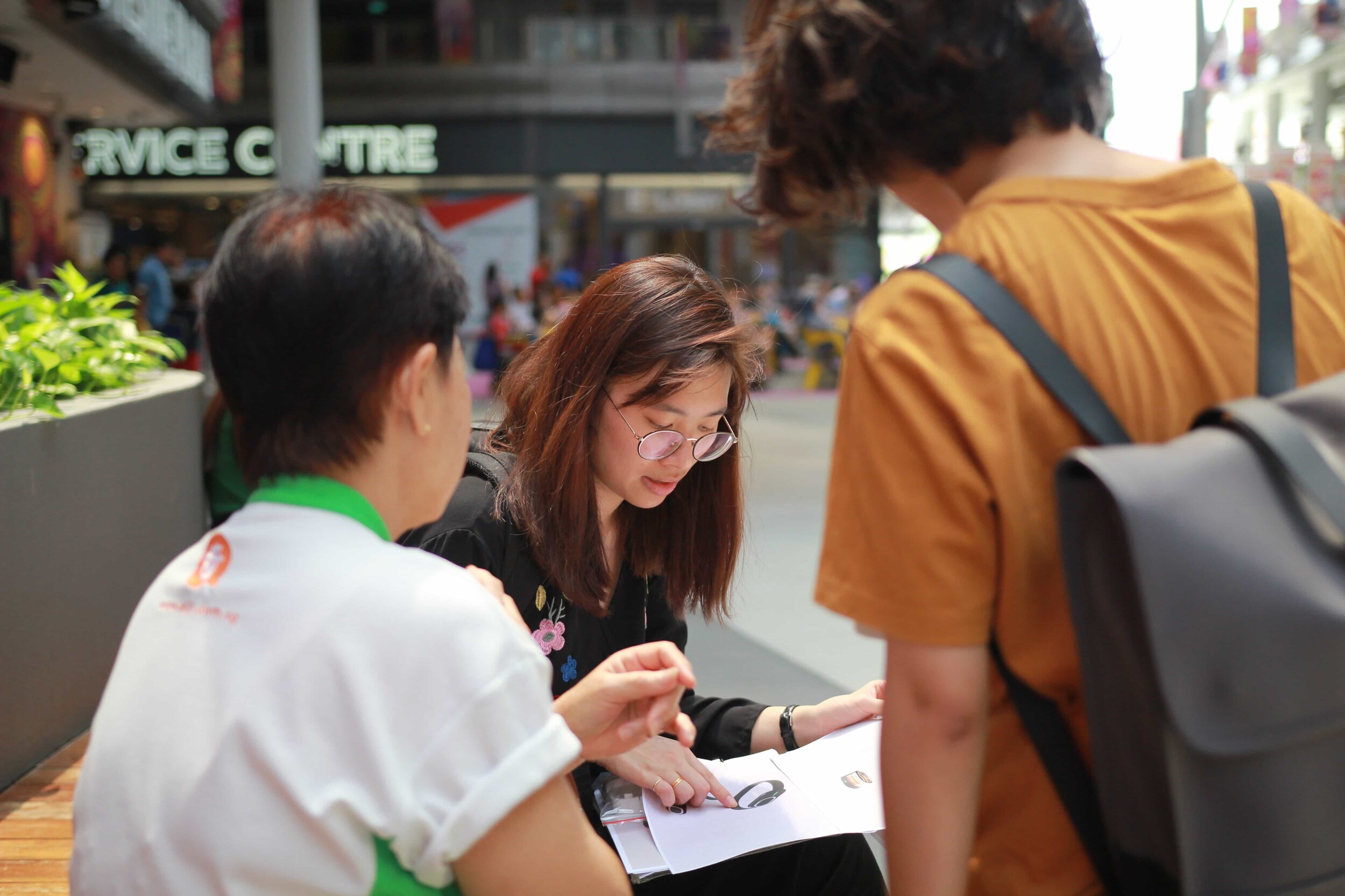
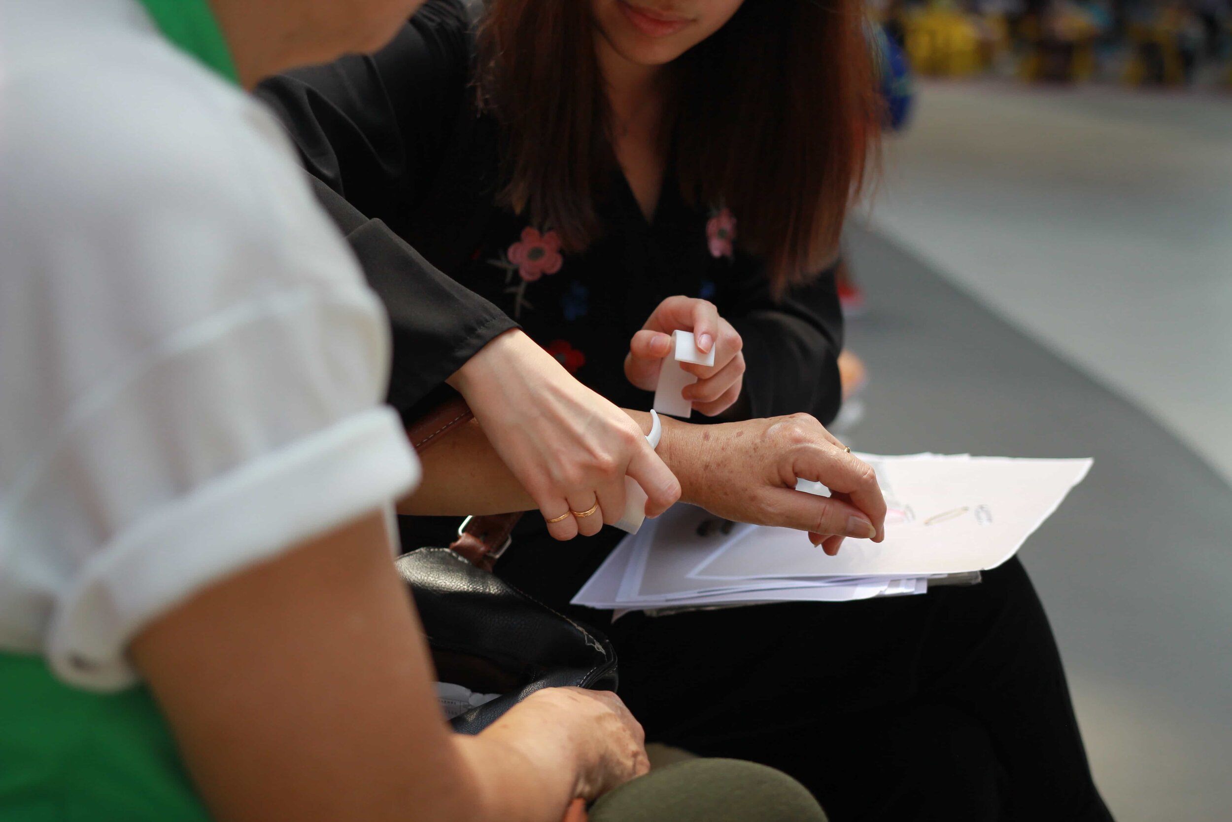
User Testing
Final Design
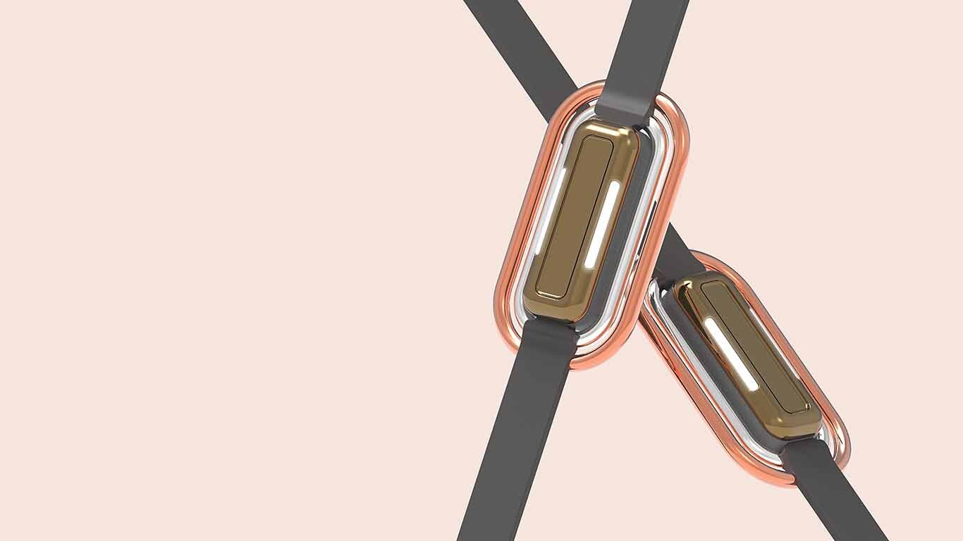
“Bring out the Hero in you”
Design Elements
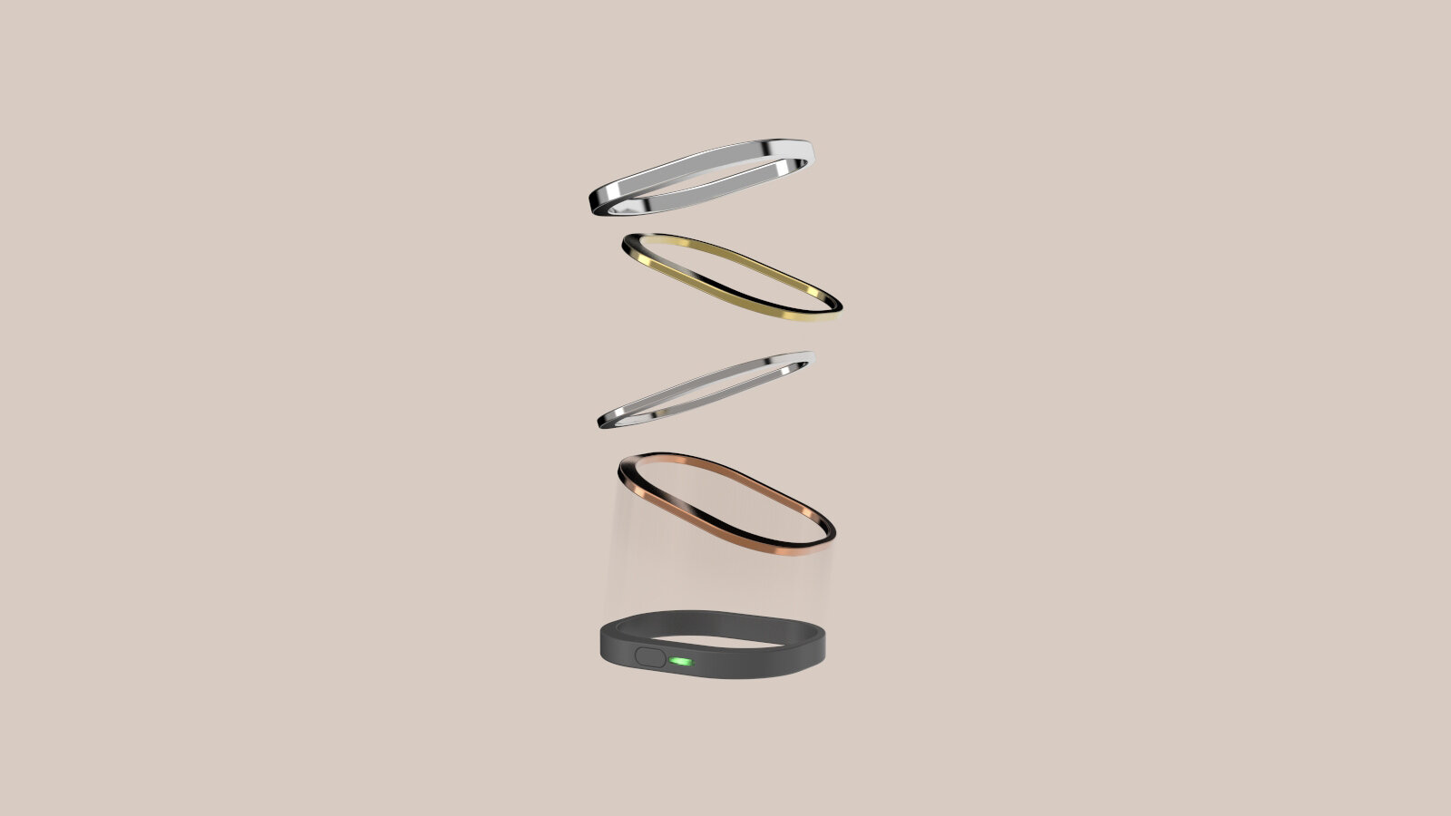
Design elements driven by insight of desiring social recognition.
Driven by the insight of elderlies desires social recognition, the wearable is designed to encourage fulfilling some checkpoints and being rewarded by a improvement for the wearable [the Kampung rim and Hero strap]. Allowing a display of achievements fulfilled on top of the basic module received upon collection.
Technical Components
Wearable Interface
These data of the elderly’s health will all be reflected on the back-end system dashboard.
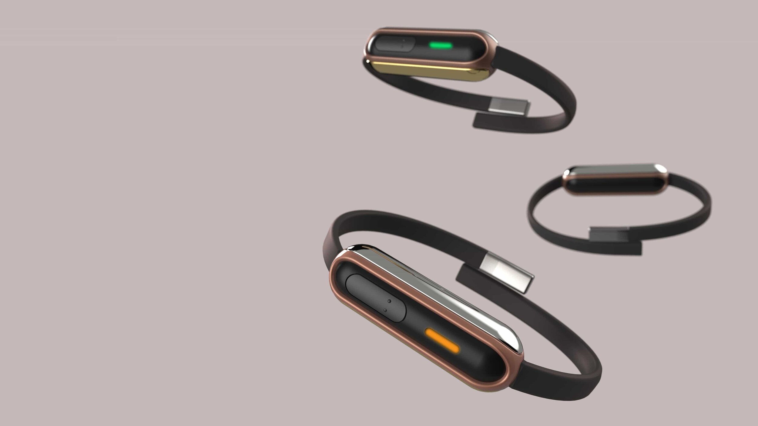
Green Vital light
When elderly is fine, health is stable and normal. While all data can be retrieved on the back-end system under the category personal data.
Orange Vital light
When elderly is feeling slightly uncomfortable, the orange vital light will lit up. With the data appear on the back-end system dashboard. The National Responders and SAC staff can then alert neighbours nearby through their wearables allowing them to drop by and check on the elderly.
This results in a more efficient system, reducing time taken for someone to be present at the location and reduce situation of false alarm.
For the elderlies, it also foster a sense of community and responsibility, encouraging them to lookout for one another. A design feature driven by the insight of desiring human connection.
Red Vital light
When elderly is in a danger state, the red light will lit up, reflecting on the back-end system dashboard allowing them to immediately call for ambulance to transfer the casualty. This design feature bridges the gap between the front and back-end system.
Information Architecture
Mainly we removed any form of a collapsable menu, ensuring the consistency of each landing page, paying attention to visual hierarchy
Paper Prototyping
The wireframes were iterated to ensure that it fits the needs of our users. Although we did not manage to get a follow-up feedback session with our prototype, we did ensure that decisions made by the team best address our user's needs.
Details:
Further reduce the number of clicks required to get to another landing page
Reduce recall & recognition for the graphs
Call for help section is not prominent enough
Reduce the effort users have to learn how to navigate on a new landing page
Dashboard Elements
We designed a dashboard for less tech-savvy users, that requires little to no navigation but still allowing themselves to be informed with the current emergency status of the community.
01
We redesigned the initial layout we proposed and relocated the health assist alert at the top right of the page, ensuring higher accessibility by our users.
02
We kept it simple - By removing the hamburger menu, the accessibility to another page is just a click away.
03
Even in night mode, we kept the consistency of the visual language, so that users are not required to relearn how to navigate the landing pages.
A short animation of the back-end system user interface.
Packaging Design
The Film
This is a short video that tells the narrative of our project to see how the back-end system would integrate with the product designed.
Filmed & Directed by : Ong Kahmin [lead] & Luowei Ng & Tan Kahwee
Post-processed by : Ong Kahmin
Through Kampung Heroes,
let’s bring out the Hero in you!
Thanks for viewing!


